> ## Documentation Index
> Fetch the complete documentation index at: https://visitdocs.planpoint.io/llms.txt
> Use this file to discover all available pages before exploring further.
# Dark mode
> Let visitors flip the Visit to a dark theme, and choose the dark background colour.
Dark mode is **off by default**. Turn it on in the [style editor](/customize/style-editor) under **Theme → Dark mode toggle**.
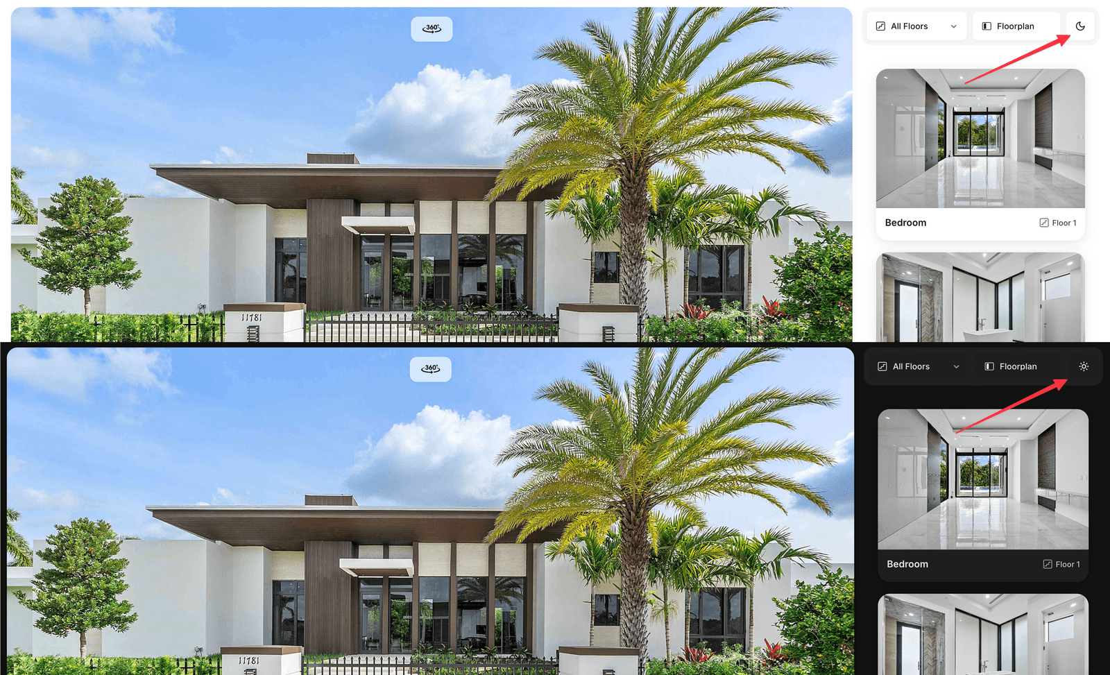
Once enabled, a small sun/moon button appears in the viewer's filter row, next to the language flag. The visitor's choice is remembered on their device.
 ## What changes
Only the neutral surfaces flip: background, cards, borders, text and the chrome buttons over the plan. Your **brand accent** is preserved, so viewpoint markers and hotspots keep their colour.
The default dark palette is a near-black grey rather than navy — it keeps photography looking natural instead of tinting it blue.
## Dark background colour
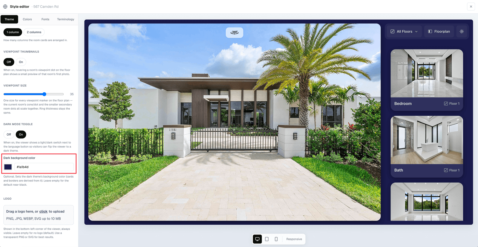
With the toggle on, an extra **Dark background color** field appears. Set it to any hex value and the card and border shades are derived from it automatically — one colour is enough to tint the whole dark theme.
Leave it empty for the default near-black.
## What changes
Only the neutral surfaces flip: background, cards, borders, text and the chrome buttons over the plan. Your **brand accent** is preserved, so viewpoint markers and hotspots keep their colour.
The default dark palette is a near-black grey rather than navy — it keeps photography looking natural instead of tinting it blue.
## Dark background colour
With the toggle on, an extra **Dark background color** field appears. Set it to any hex value and the card and border shades are derived from it automatically — one colour is enough to tint the whole dark theme.
Leave it empty for the default near-black.
 ## Notes
The **Glass** layout theme shows a minimal panel on entry, so the dark-mode button (like the language button) only appears once the browse panel is visible.
* Dark mode is separate from the **dashboard** dark mode. Switching the dashboard theme does not affect what buyers see.
* Photos are never dimmed or filtered — only the interface around them changes.
Dark mode makes bright interior photography pop. If a property was shot in low light, preview it in both modes before enabling — the extra contrast can be unflattering.
## Notes
The **Glass** layout theme shows a minimal panel on entry, so the dark-mode button (like the language button) only appears once the browse panel is visible.
* Dark mode is separate from the **dashboard** dark mode. Switching the dashboard theme does not affect what buyers see.
* Photos are never dimmed or filtered — only the interface around them changes.
Dark mode makes bright interior photography pop. If a property was shot in low light, preview it in both modes before enabling — the extra contrast can be unflattering.