

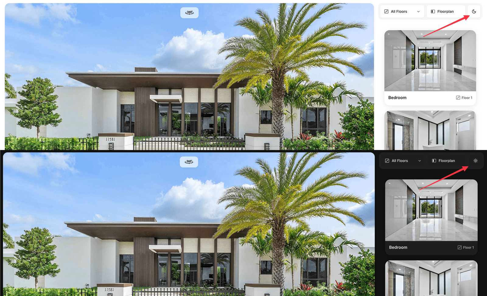
The same Visit in light and dark mode
What changes
Only the neutral surfaces flip: background, cards, borders, text and the chrome buttons over the plan. Your brand accent is preserved, so viewpoint markers and hotspots keep their colour. The default dark palette is a near-black grey rather than navy — it keeps photography looking natural instead of tinting it blue.Dark background colour
With the toggle on, an extra Dark background color field appears. Set it to any hex value and the card and border shades are derived from it automatically — one colour is enough to tint the whole dark theme. Leave it empty for the default near-black.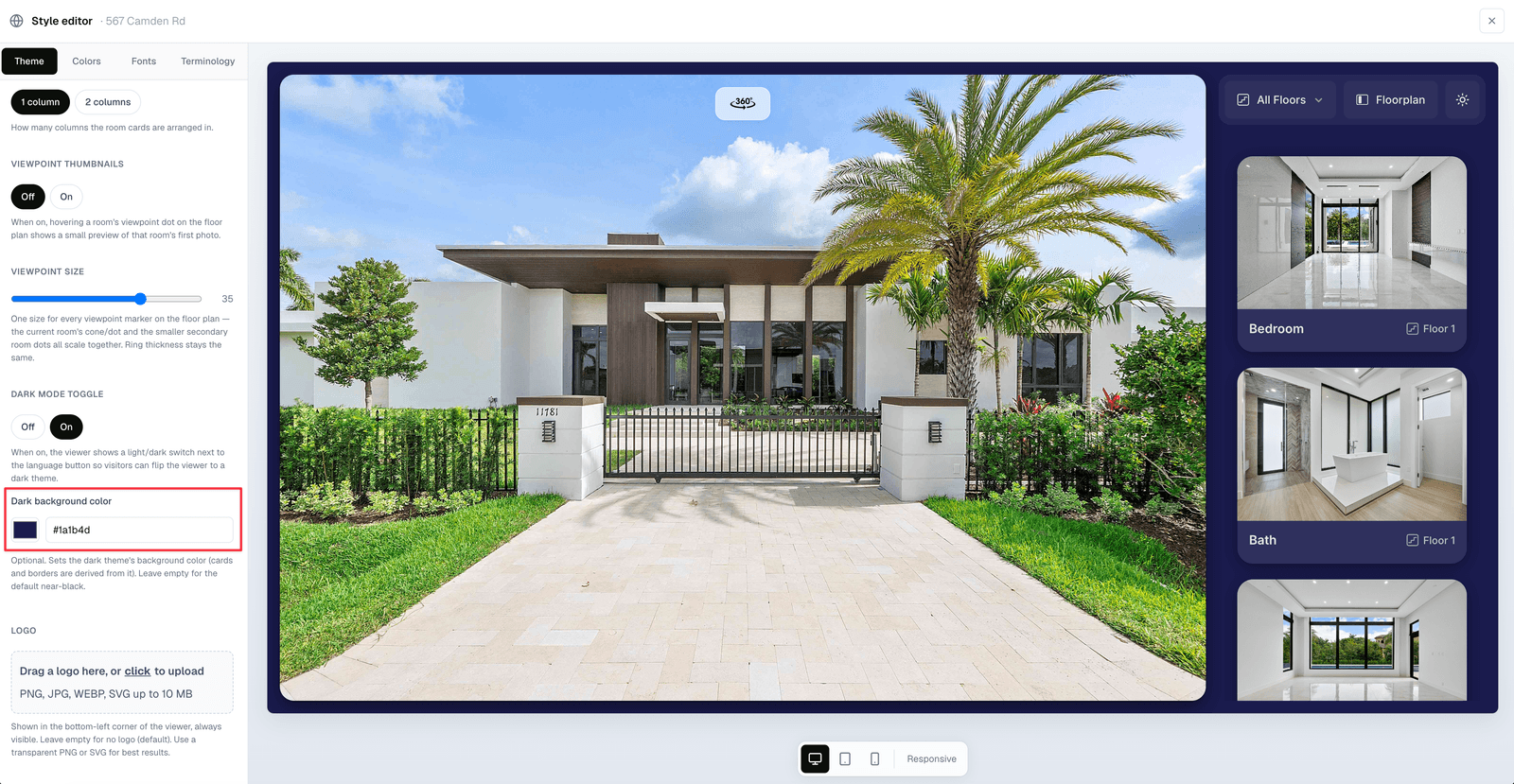
An optional custom dark background — surfaces and borders follow it
Notes
The Glass layout theme shows a minimal panel on entry, so the dark-mode button (like the language button) only appears once the browse panel is visible.
- Dark mode is separate from the dashboard dark mode. Switching the dashboard theme does not affect what buyers see.
- Photos are never dimmed or filtered — only the interface around them changes.