

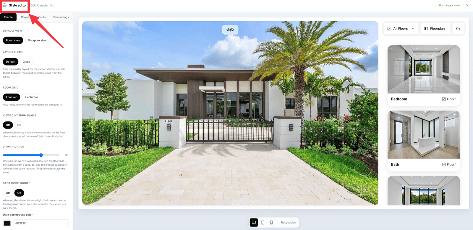
The style editor — every change appears in the live preview immediately
Default view
Which pane buyers land on:- Room view — the browsable list of room cards. Best for homes with good photography.
- Floorplan view — the plan next to the photo. Best when the plan is the selling point.
Layout theme
- Default — the standard two-pane layout.
- Glass — a frosted, more editorial variant where the browse panel floats over the media.
Room grid
How many columns the room cards use: 1 column or 2 columns. New properties start at 1 column, which gives each room a large, magazine-style card. Two columns suit properties with many rooms.In 1-column mode the room list pane is deliberately kept narrow so a single card does not stretch to the width of two. The column resizer is hidden in this mode for the same reason.
Column resizer
In 2-column mode, a drag handle appears between the two panes of the preview. Drag it to decide how much space the media gets versus the browse panel; the ratio is saved with the property and used on desktop.Viewpoint thumbnails
Off by default. When on, hovering a room’s viewpoint marker on the floor plan pops up a small preview of that room’s first photo. See Viewpoints.Viewpoint size
A single slider (6–48) that scales every viewpoint marker — the current room’s cone and the smaller secondary dots — together. Ring thickness stays constant, so markers never look chunky at large sizes.Dark mode toggle
Off by default. When on, a light/dark switch appears next to the language button in the viewer, and visitors can flip the whole Visit to a dark theme. See Dark mode.Logo
Pro feature
Adding a brand logo to the viewer requires the Pro plan.
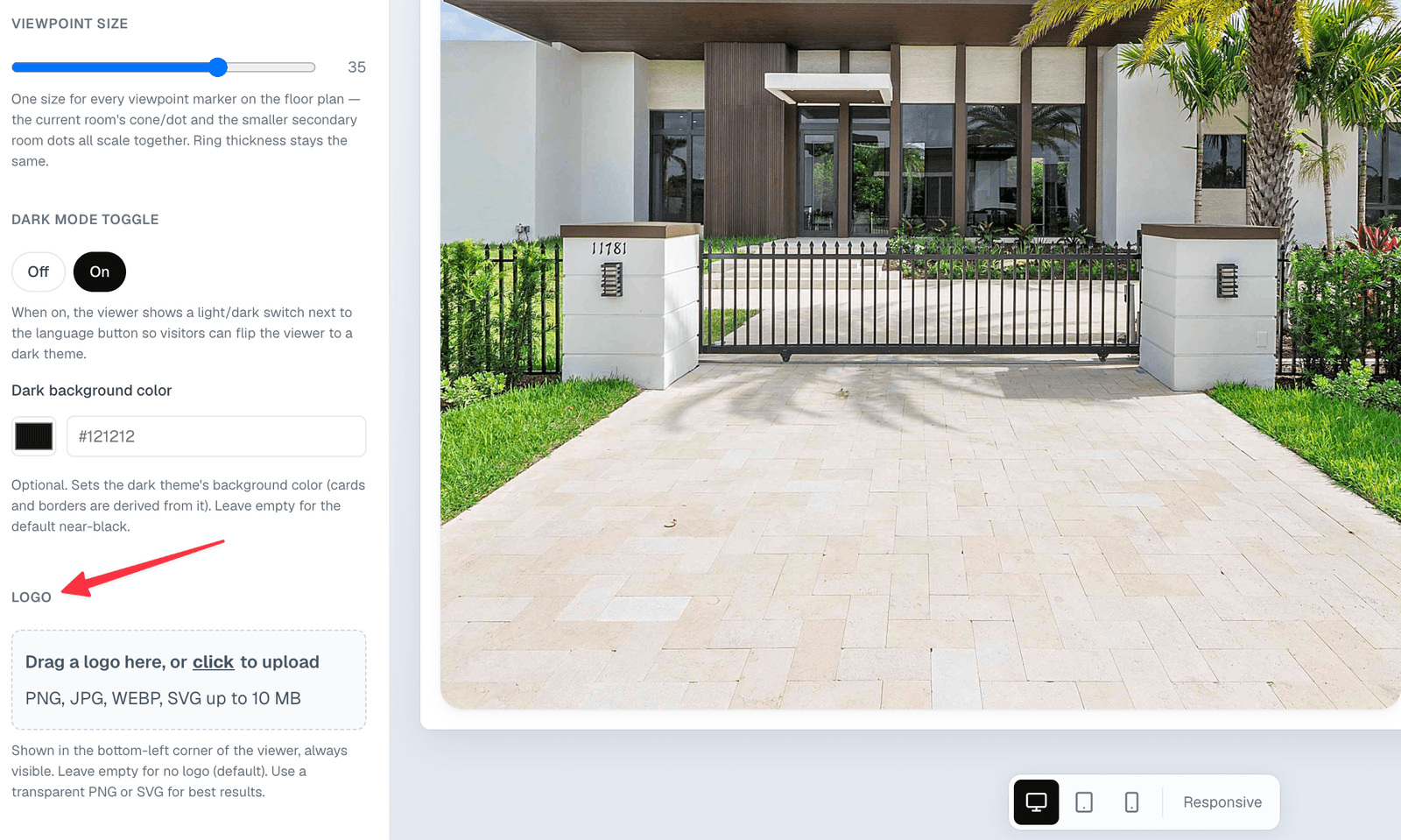
The logo sits in the bottom-left corner and stays visible throughout the tour